All apps
View on App Store
4.7
275.8K ratingsScreenshot story
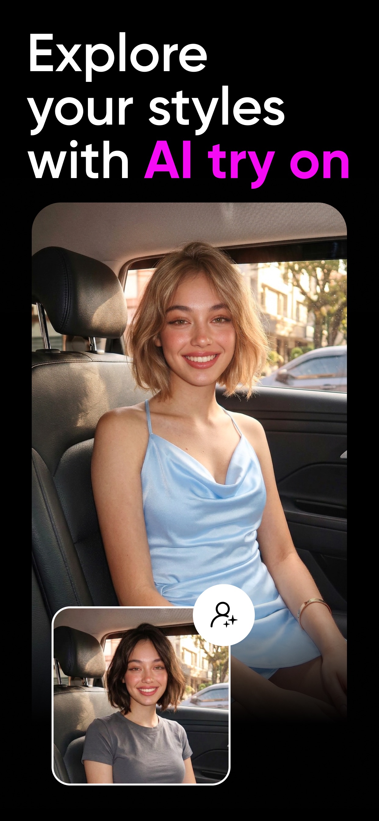
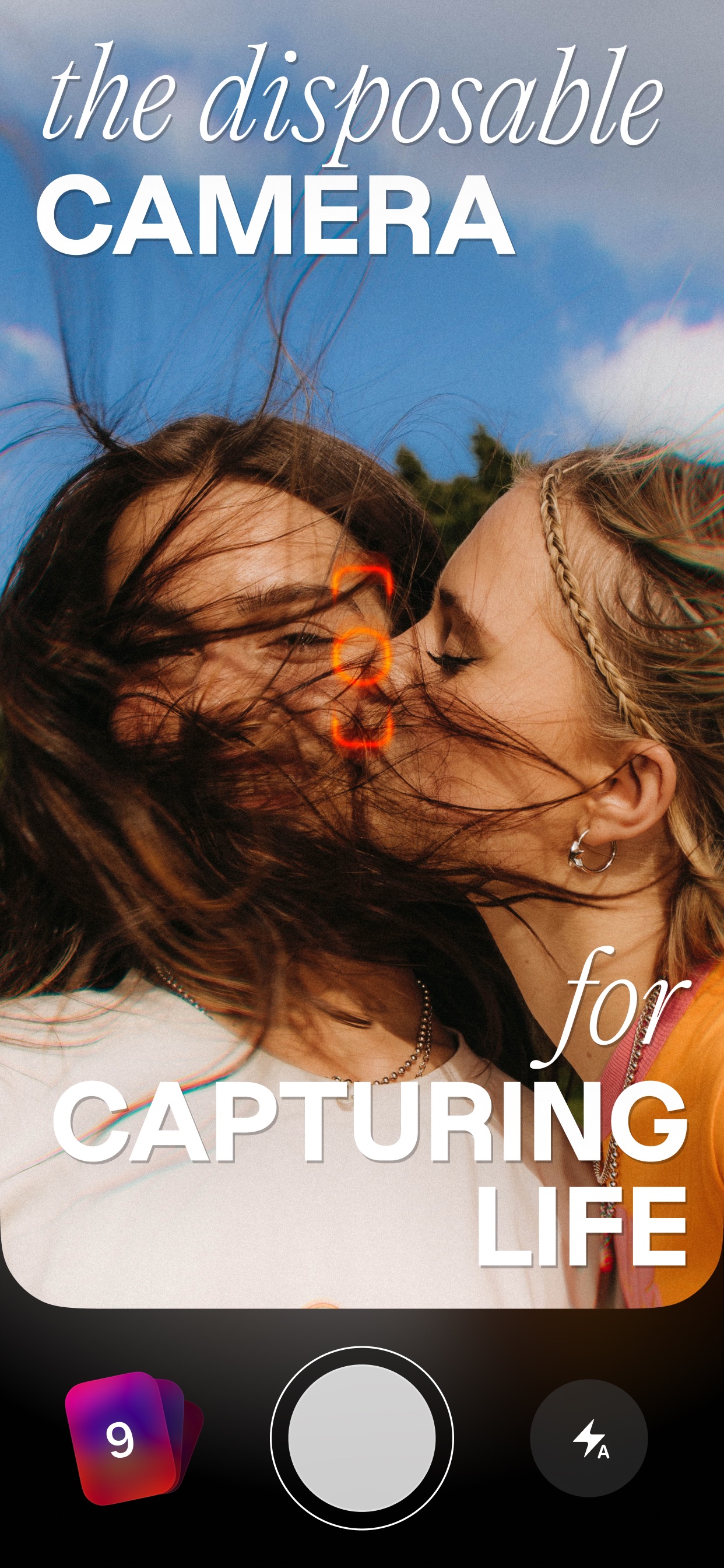
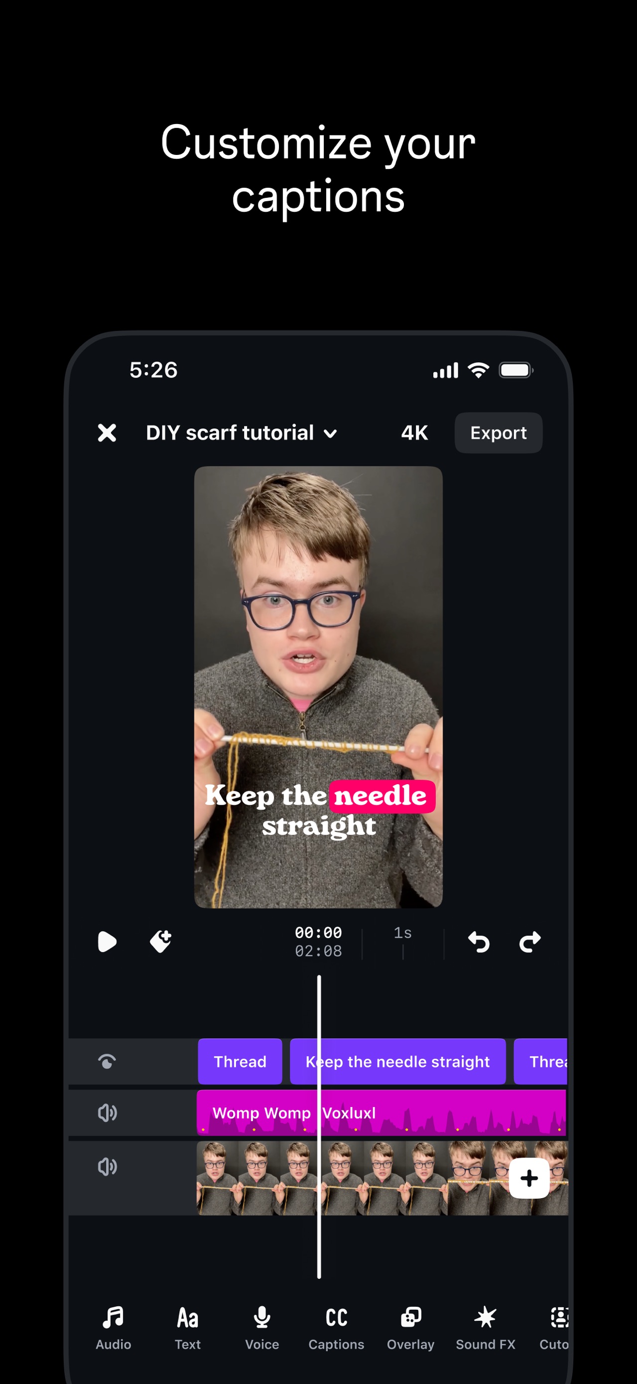
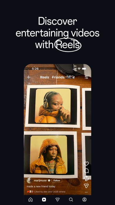
The sequence opens with an aspirational lifestyle hook establishing VSCO as a professional tool, then demonstrates core editing power (Presets, Tools, Effects) before pivoting to the social utility of building a creative career through Feed, Profile, and collaborative Spaces.
iPhone gallery
The complete screenshot set
Select any frame to study its layout, content, and palette.
Explore by detail
Study the system behind the set
Design analysis
What makes this set work
VSCO employs a sophisticated editorial design language that mirrors the high-end photography its users produce. By placing sharp, high-contrast UI panels over blurred, context-aware backgrounds, they create a sense of depth and focus. The copywriting is lean and authoritative, using a hierarchical typographic system with heavy sans-serif headers and lighter sub-captions. A standout strategy is the 'Before/After' split-screen UI in screenshots 2 and 4, which provides instant visual proof of the app's value. Designers should note the use of dark mode across the entire set, which allows the vibrant colors of the photography to pop. This 'UI-as-art' approach makes the utility feel like a creative playground rather than just a utility.
Keep exploring