All apps
View on App Store
4.5
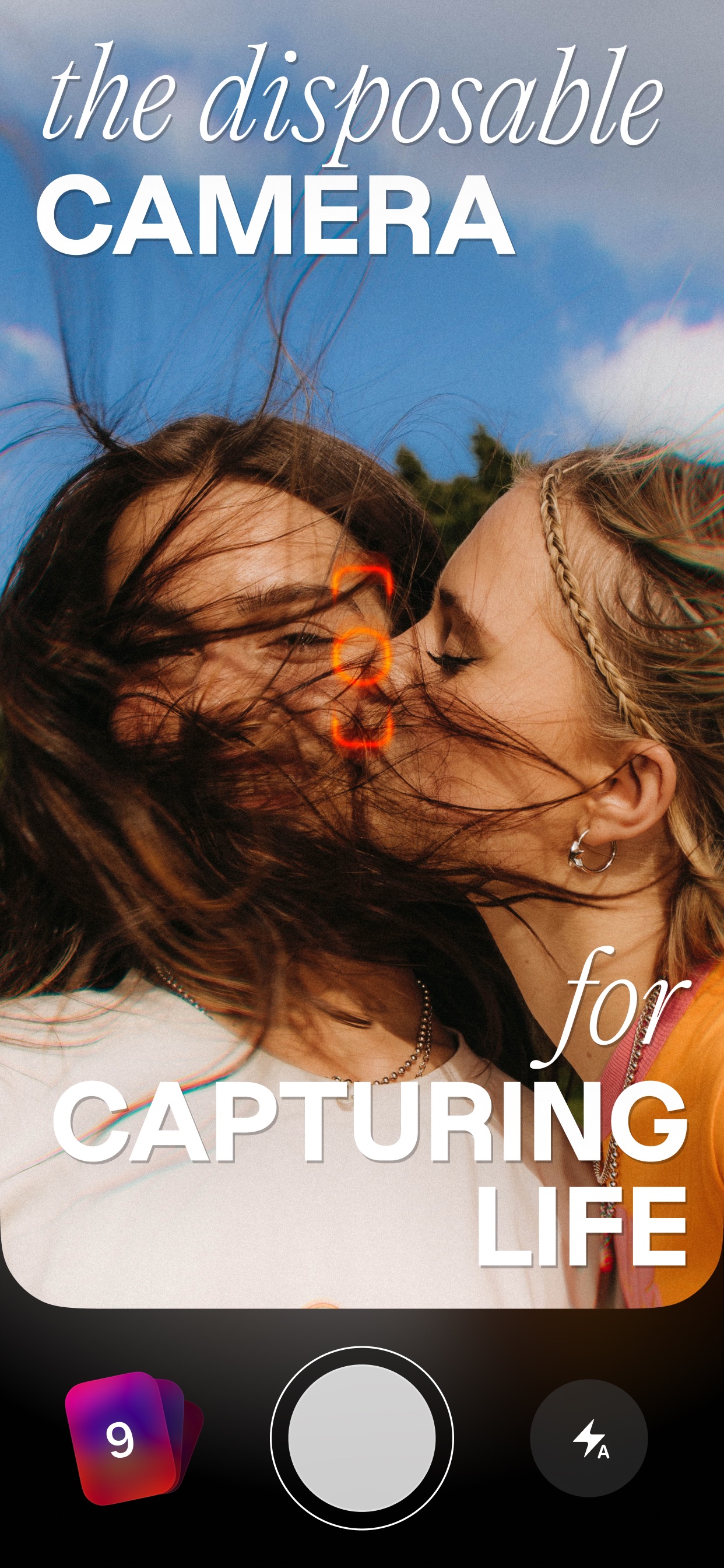
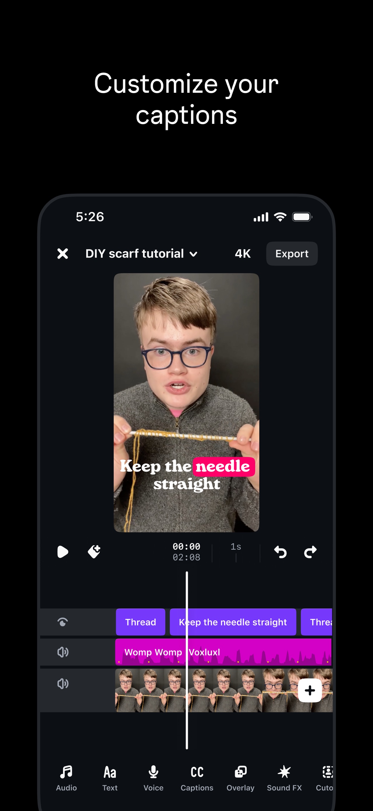
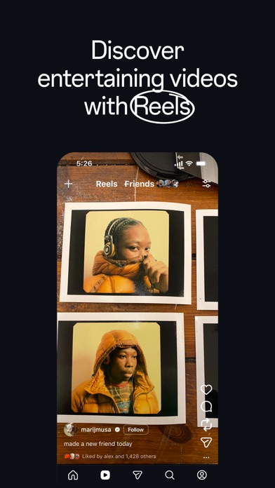
5.9M ratingsScreenshot story
The flow begins with the core act of 'Snapping' and 'Chatting' with friends, moves through entertainment-heavy features like Lenses and Spotlight, and concludes with long-term value via the Map and personal Memories.
iPhone gallery
The complete screenshot set
Select any frame to study its layout, content, and palette.
Explore by detail
Study the system behind the set
Design analysis
What makes this set work
Snapchat’s screenshot strategy is a masterclass in brand-first consistency. By utilizing a high-contrast solid yellow background across all nine frames, the app claims immediate visual ownership of the user’s eye. Each slide follows a strict template: a bold, all-caps header followed by a concise benefit-led subheadline, with a rounded floating UI container below. This layout prioritizes the content within the app-AR lenses, 3D Bitmojis, and vibrant photography-rather than the device hardware. Designers should note how the use of distinct 'modes' (light for Chat/Map/Memories, dark for media viewing) creates a rhythm that guides the user through the app’s diverse feature set without breaking the visual identity.
Keep exploring