All apps
View on App Store
4.8
8.8K ratingsScreenshot story
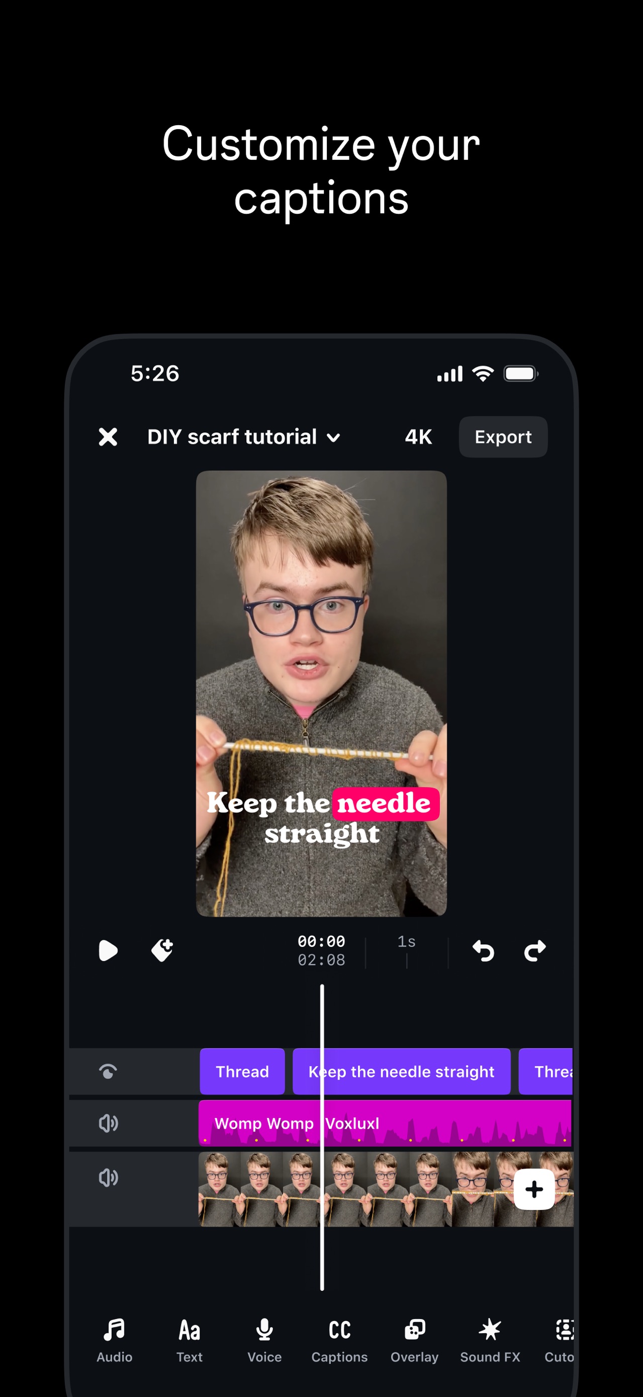
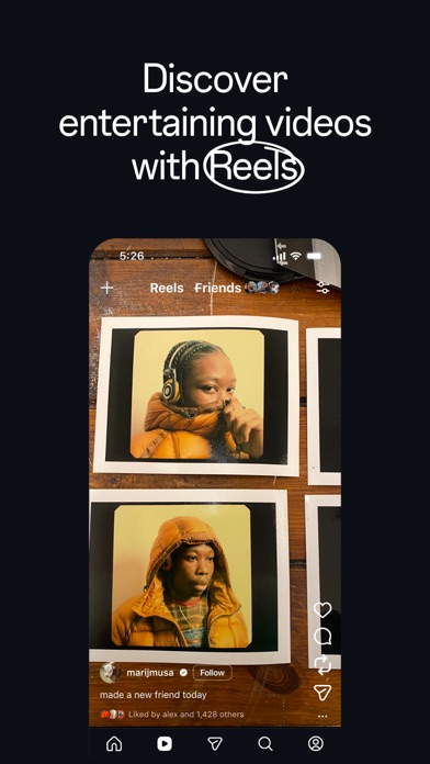
The set begins by establishing a private social space for friends before showcasing unique utility features like physical postcards and curated digital recaps, finally closing with a lifestyle-driven emotional appeal.
iPhone gallery
The complete screenshot set
Select any frame to study its layout, content, and palette.
Explore by detail
Study the system behind the set
Design analysis
What makes this set work
Retro's design strategy is a masterclass in using 'editorial' aesthetics to differentiate a social product. By utilizing a serif font for marketing copy and high-contrast 'floating device' layouts against grainy, atmospheric background gradients, the app avoids the clinical feel of modern SaaS. The color palette changes per slide to match the specific vibe of the feature-olive for postcards, teal for privacy-yet remains cohesive through shared texture. Designers should take note of how the use of 'analog' visual cues (grainy textures and Polaroid frames) reinforces the product's core value proposition of timelessness and memory-keeping.
Keep exploring