All apps
View on App Store
4.7
203.7K ratingsScreenshot story
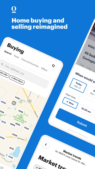
The set begins with a powerful hook of community scale and quickly transitions into a detailed walkthrough of daily connection tools, from games to expert advice. It concludes with authentic user testimonials that validate the app's emotional promise.
iPhone gallery
The complete screenshot set
Select any frame to study its layout, content, and palette.
Explore by detail
Study the system behind the set
Design analysis
What makes this set work
Paired utilizes a singular, high-energy brand purple (#7b42f6) across all slides to anchor the visual identity, creating a high-contrast backdrop for the lighter UI elements. The design strategy employs a 'Benefit-Feature Sandwich': opening and closing with social proof (real couple collages and testimonials) while the core slides use floating device frames to detail functionality. Each feature slide uses a split-caption hierarchy, with a bold benefit at the top and a descriptive action at the bottom. A key design 'steal' is the use of 'popped-out' UI components-specifically question cards and result badges-that break the frame of the floating device. This highlights specific interactions and makes the dense content feel more accessible and tactile to the potential user.
Keep exploring