All apps
View on App Store
4.8
1.4M ratingsScreenshot story
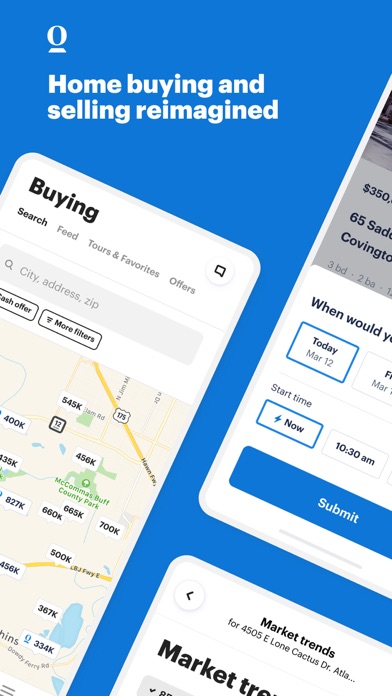
The flow begins with urgent utility through real-time alerts, moves into deep property and neighborhood exploration tools, and concludes with collaborative decision-making features like shared favorites and property comparisons.
iPhone gallery
The complete screenshot set
Select any frame to study its layout, content, and palette.
Explore by detail
Study the system behind the set
Design analysis
What makes this set work
Trulia utilizes a high-impact, color-blocked design system where each feature is framed by a vibrant, solid background and a matching device bezel. This 'rainbow' approach effectively signals transitions between different functional areas-like search, neighborhood insights, and social collaboration-keeping the dense real estate UI organized. By alternating saturated tones (Forest Green, Burgundy) with pastels (Pale Purple), they maintain visual interest throughout ten slides. Designers can emulate their strategy of using 'floating' UI elements-such as notification cards or notes overlays-that sit outside the main app frame to highlight specific micro-interactions. The copywriting is strictly verb-led, focusing on user empowerment (Save, Dive, Tour, Learn) rather than just listing app features.
Keep exploring