All apps
View on App Store
4.8
1.6M ratingsScreenshot story
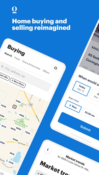
The journey begins by narrowing the search for a perfect home, moves through utility features like filtering and price alerts, and concludes with immersive tools like virtual tours to finalize the decision.
iPhone gallery
The complete screenshot set
Select any frame to study its layout, content, and palette.
Explore by detail
Study the system behind the set
Design analysis
What makes this set work
Redfin utilizes a high-contrast color rhythm, alternating between their vibrant brand red and neutral grays to keep the viewer engaged. By using 'Flat UI Panels' instead of standard device frames for most screens, they focus the user's attention on specific interactions-like a stack of notifications or a set of search filters-rather than the app's full interface. The copywriting is lean and benefit-oriented, placed consistently at the top in a bold geometric sans-serif font. A designer can steal the 'notification stack' visualization (Slide 5), which is a brilliant way to demonstrate real-time utility without showing a cluttered feed. The final lifestyle slide breaks the UI-heavy pattern to provide an emotional payoff, effectively using white space and a 360-degree graphic to signal high-tech capability.
Keep exploring