All apps
View on App Store
4.8
1.4M ratingsScreenshot story
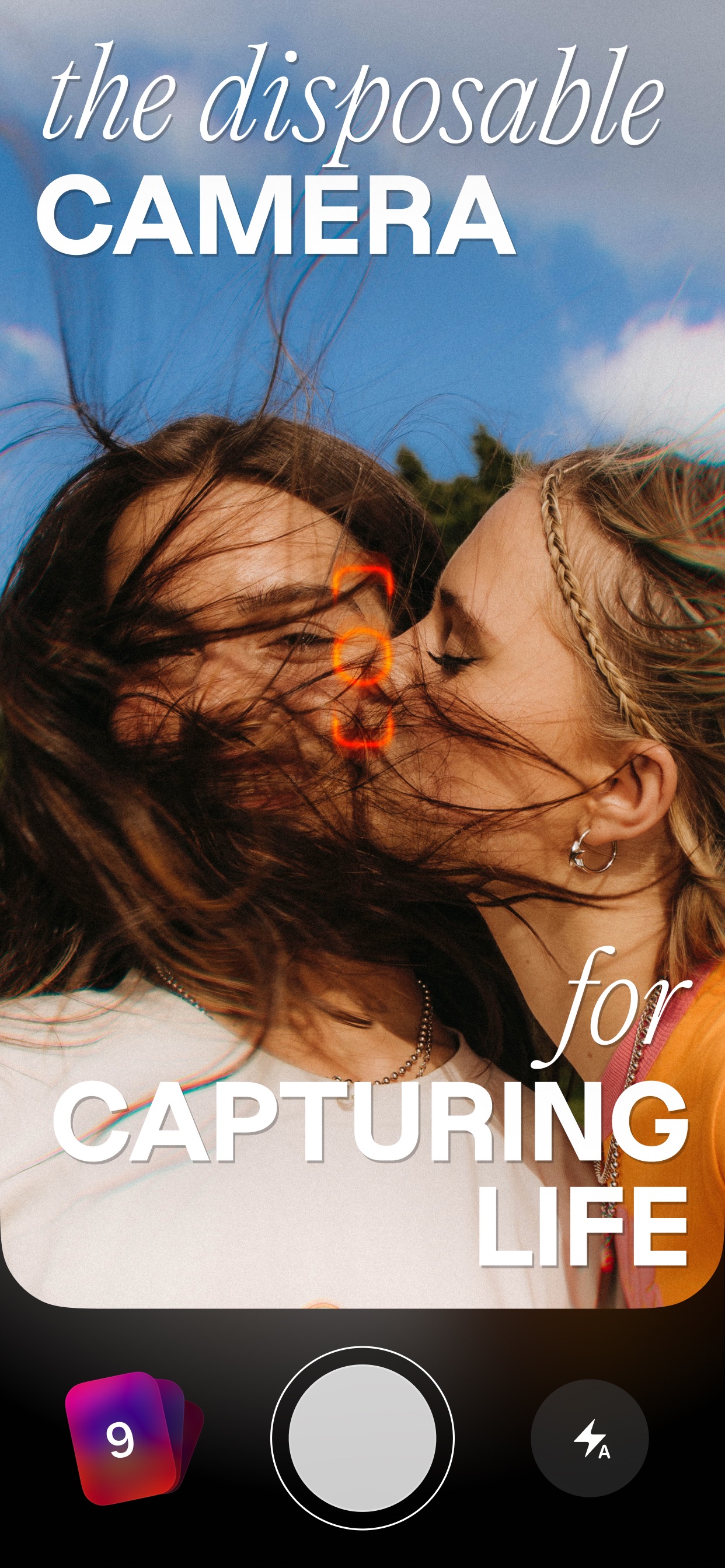
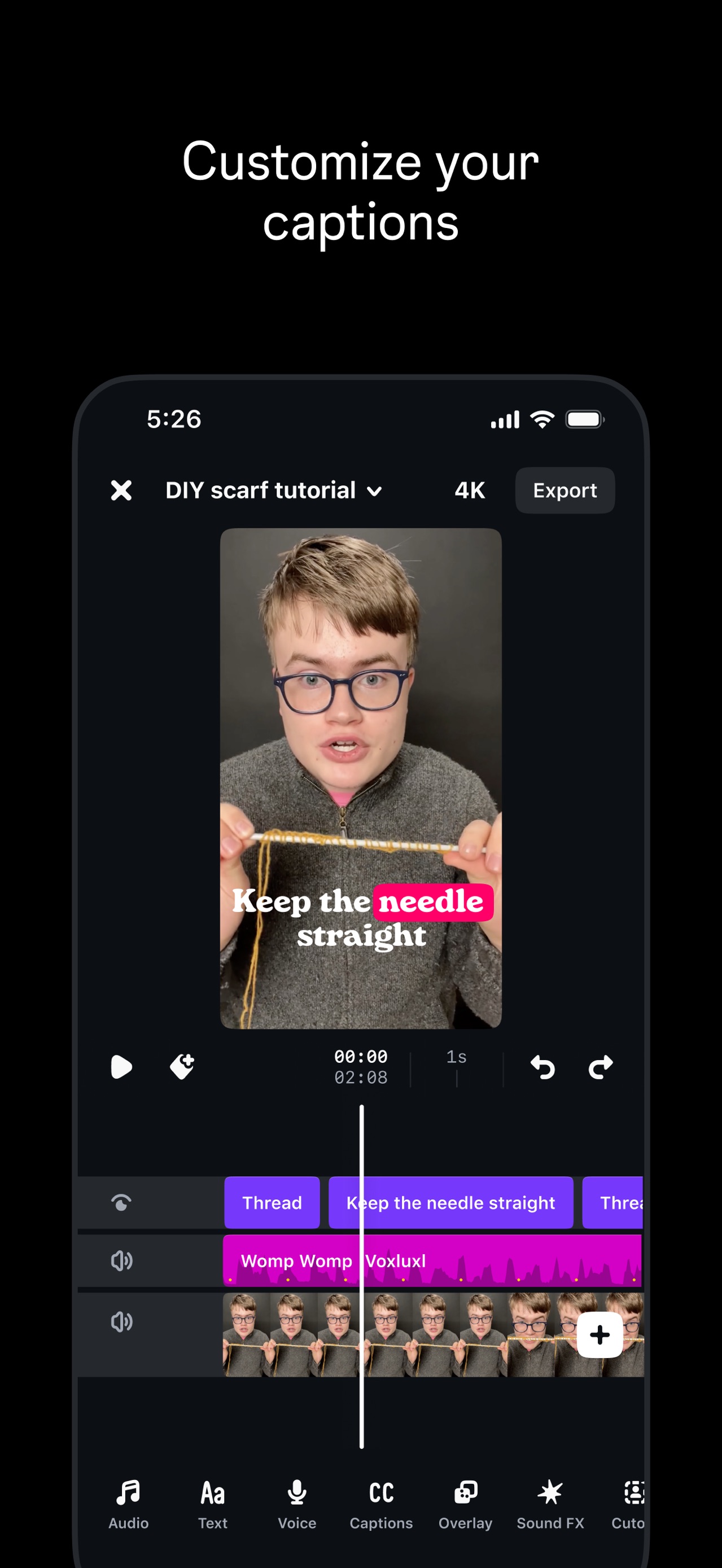
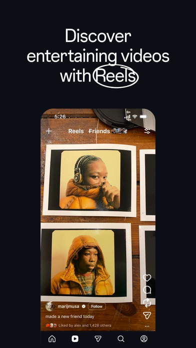
The flow hooks users with generous storage benefits before diving into a showcase of powerful AI editing, emotional curation, and smart organizational tools. It concludes with new GenAI creative features, positioning the app as an all-in-one home for memories.
iPhone gallery
The complete screenshot set
Select any frame to study its layout, content, and palette.
Explore by detail
Study the system behind the set
Design analysis
What makes this set work
Google Photos utilizes a highly disciplined 'feature-first' strategy. Each slide centers a single high-value utility-like Storage, Magic Eraser, or Search-within a clean, floating black device frame. The copywriting is notably direct, employing multi-colored text to highlight specific keywords in Google’s brand palette (green, blue, red, purple) against a sterile white background. This technique forces visual hierarchy, ensuring users identify the feature before the UI details. A designer can steal the use of context-specific UI modes; Google swaps between light and dark backgrounds depending on whether they are showcasing administrative features (sharing) or immersive content (memories), optimizing readability and emotional resonance respectively.
Keep exploring