All apps
View on App Store
4.9
3.4M ratingsScreenshot story
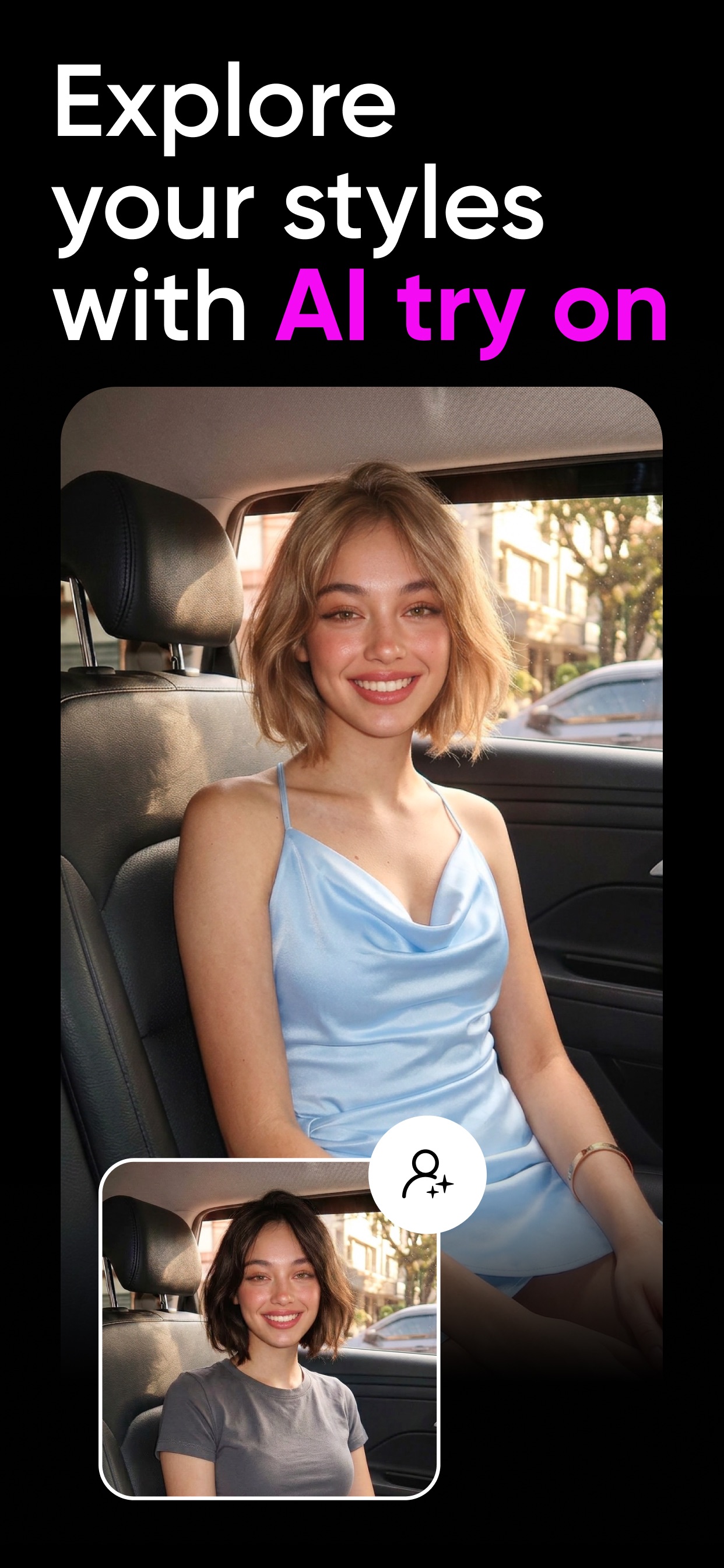
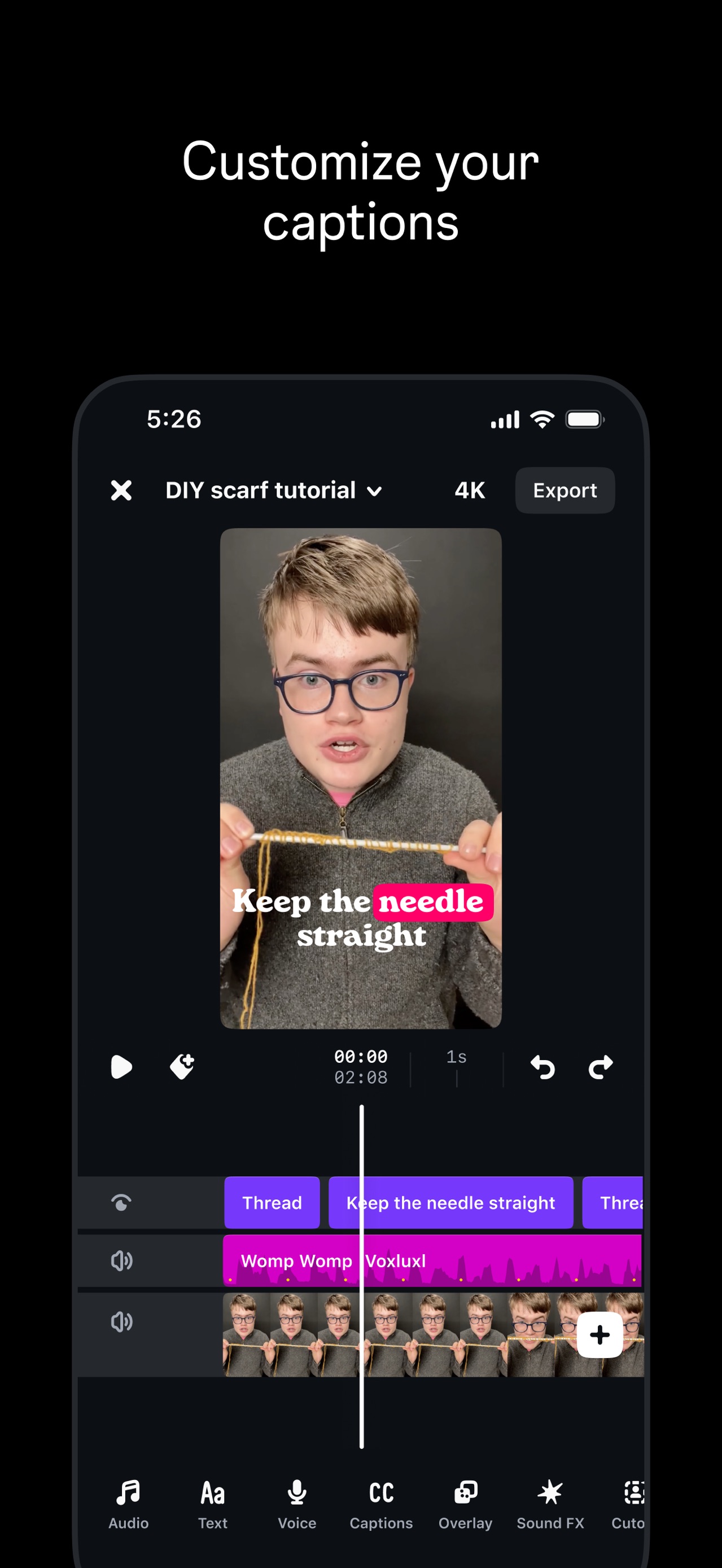
The screenshots open with a broad hook showcasing Canva's versatility across design mediums, then transition into specific high-value features like social media templates, AI generation, and video editing to prove utility. It concludes by highlighting the massive depth of its asset library, positioning the app as an all-in-one creative powerhouse.
iPhone gallery
The complete screenshot set
Select any frame to study its layout, content, and palette.
Explore by detail
Study the system behind the set
Design analysis
What makes this set work
Canva employs a high-contrast, 'maximalist utility' strategy. The layout consistently places the marketing caption at the top in a clean sans-serif font, leaving the bottom 75% of the frame for detailed UI demonstrations. This 'flat-ui-panel' approach serves as a tutorial, reducing the perceived learning curve by showing exactly how the tools function. The color palette is anchored in Canva’s brand purple but uses high-vibrancy accents (neon yellow, mint green) to signal creativity and modernity. Designers can steal the 'before/after' slider technique used in the AI backgrounds slide and the 'Magic Studio' modal, which effectively categorizes complex AI features into digestible, icon-driven choices. The use of user-centric labels like 'Alex' or 'You' in the collages adds a layer of social relatability.
Keep exploring