All apps
View on App Store
3.9
80.4K ratingsScreenshot story
The set opens with an impressive hook regarding the platform's massive user base before walking through core features like group messaging, high-quality calling, social feeds, and safety controls.
iPhone gallery
The complete screenshot set
Select any frame to study its layout, content, and palette.
Explore by detail
Study the system behind the set
Design analysis
What makes this set work
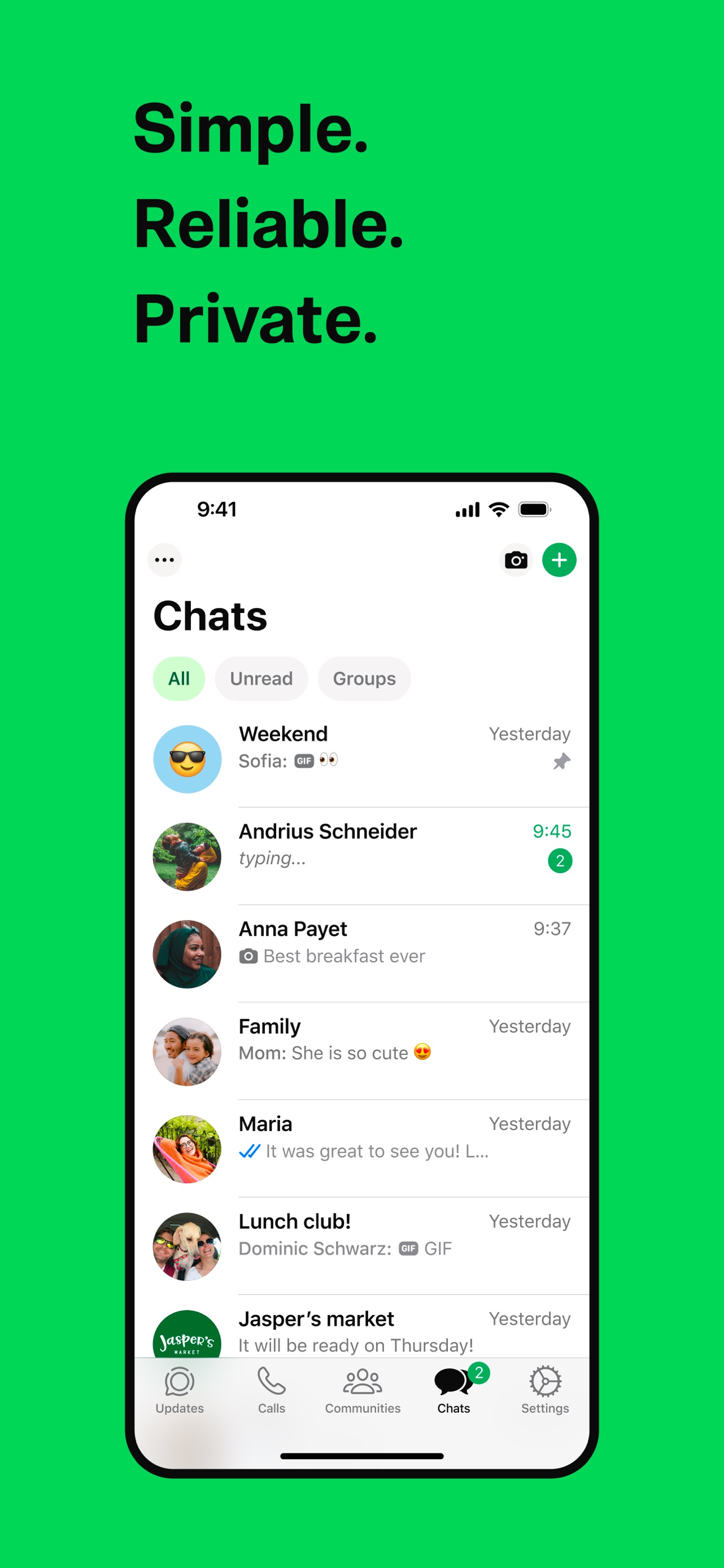
WeChat employs a highly disciplined and brand-consistent design strategy. Every screenshot uses a uniform green gradient background with subtle organic waves, immediately identifying the brand before a user reads a single word. The floating-device layout keeps the focus on the high-fidelity UI, showcasing realistic social interactions (group chats with media, video calls with expressive faces). The copywriting is direct and numbers-driven, emphasizing the platform's scale (a billion people, 500-person chats). Designers should note the hierarchical consistency: a large title followed by a functional sub-header, all in white for maximum contrast against the green background. It’s a masterclass in using brand color to create a cohesive environment while maintaining high legibility.
Keep exploring