All apps
View on App Store
4.7
226.1K ratingsScreenshot story
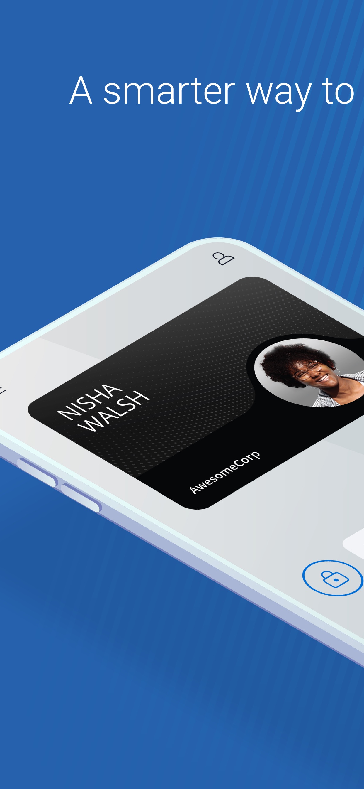
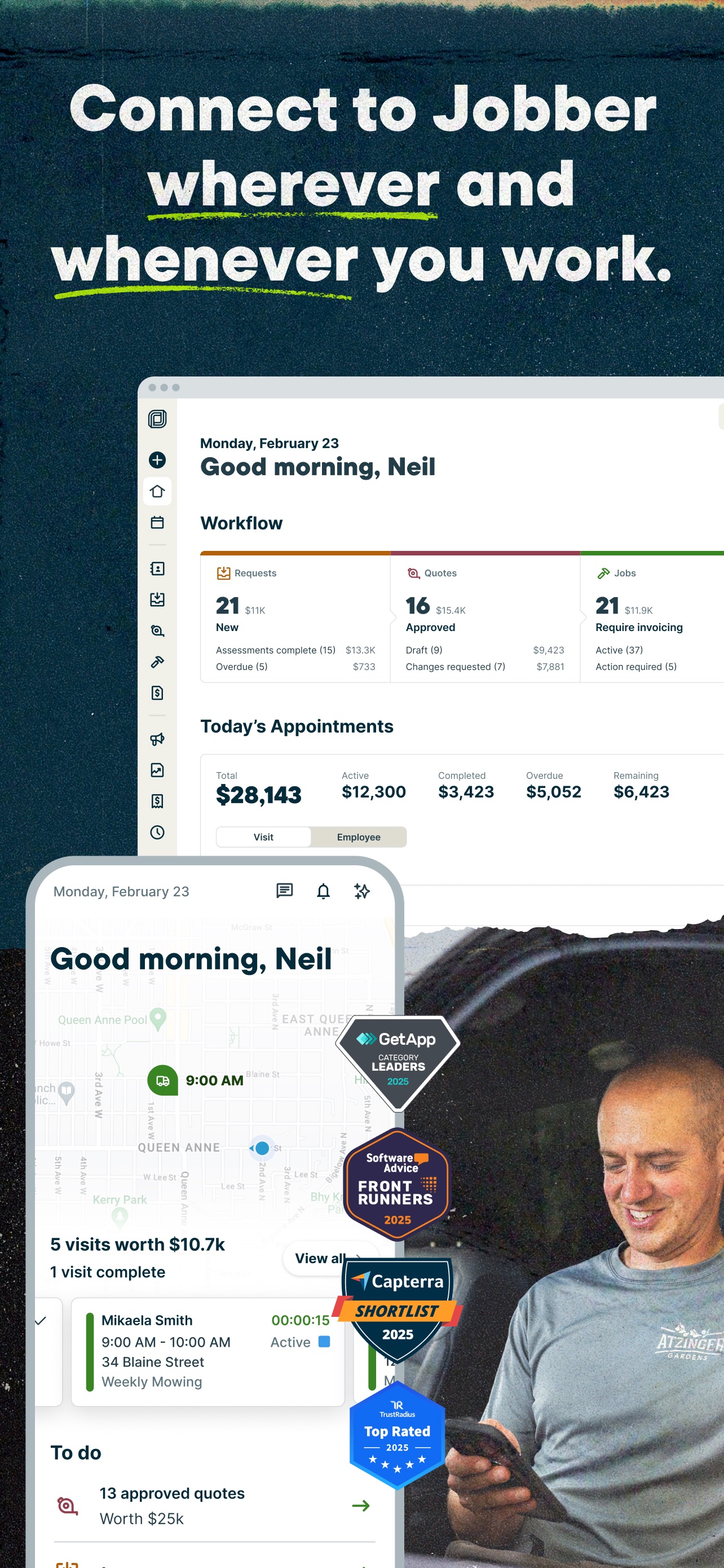
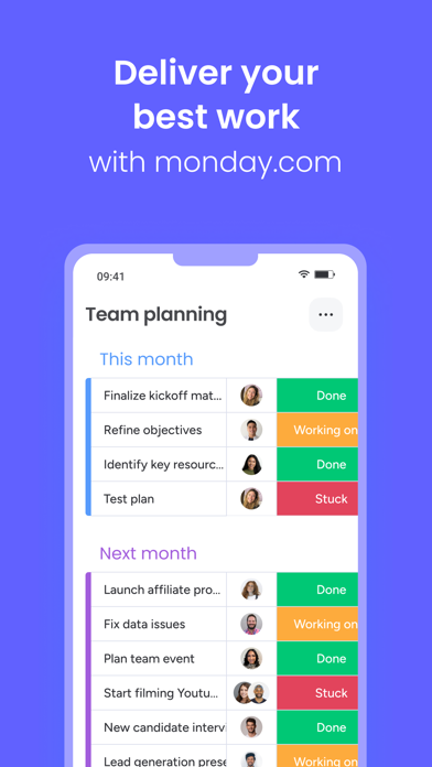
The screenshots pitch the gig economy lifestyle by first highlighting the personal and community impact, followed by the flexibility of scheduling, transparency of weekly pay, and performance metrics for drivers.
iPhone gallery
The complete screenshot set
Select any frame to study its layout, content, and palette.
Explore by detail
Study the system behind the set
Design analysis
What makes this set work
Shipt employs a strict vertical rhythm, allocating the top 40% of every screen to a high-contrast cream header section. This area uses a sophisticated serif typeface for benefits and a clean sans-serif for secondary details, anchored by a circular icon that establishes a visual 'anchor' for each slide. By using a lifestyle photo for the first slide and cropped, floating UI elements for the rest, the design bridges the gap between the emotional hook (community) and the functional utility (earning money). Designers should note the color-coded UI indicators (red for Target, purple for stats) that keep the otherwise minimal interface visually engaging while maintaining a premium, trustworthy aesthetic through the consistent deep navy text.
Keep exploring