All apps
View on App Store
0
0 ratingsScreenshot story
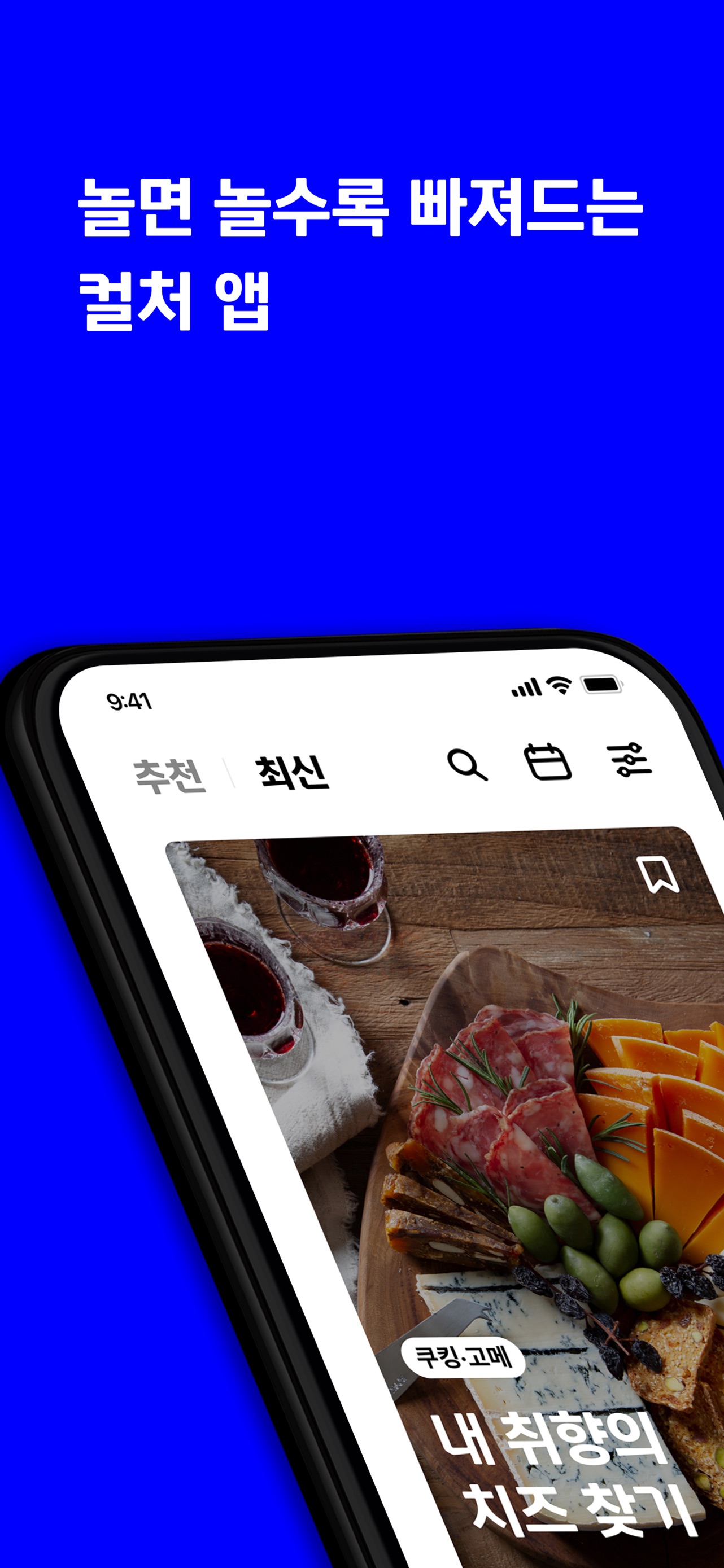
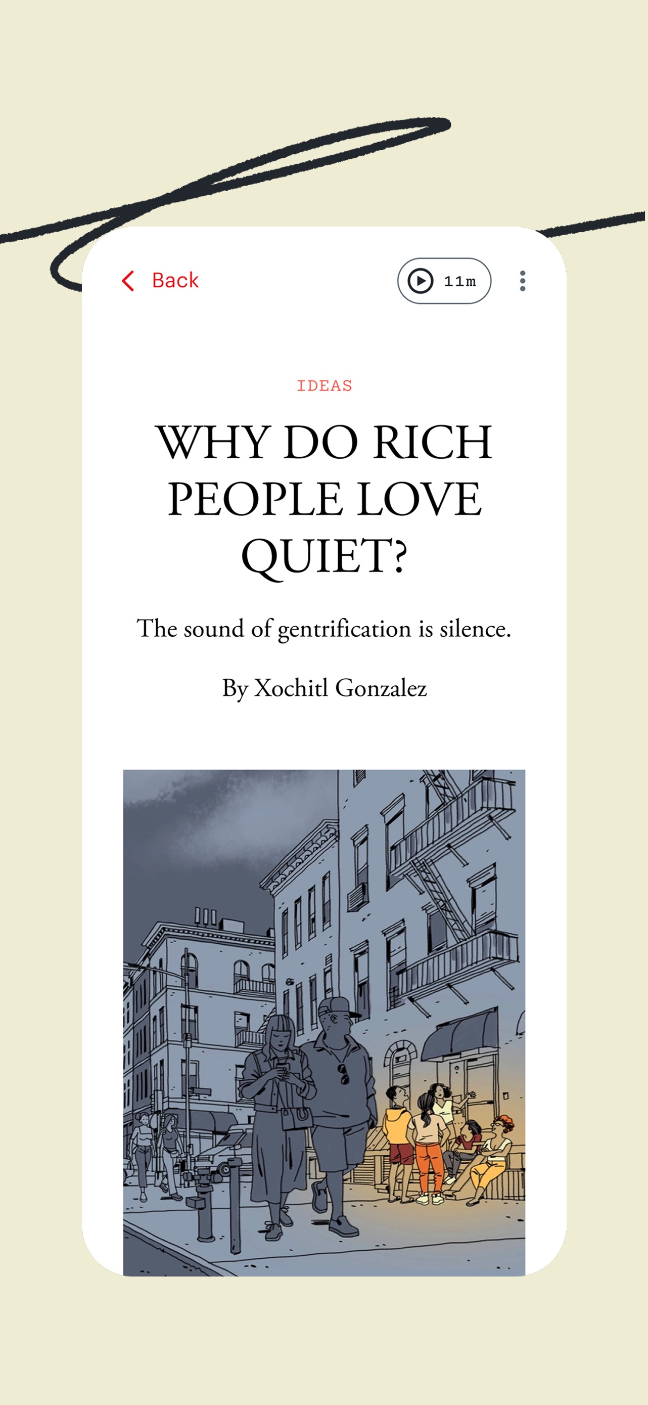
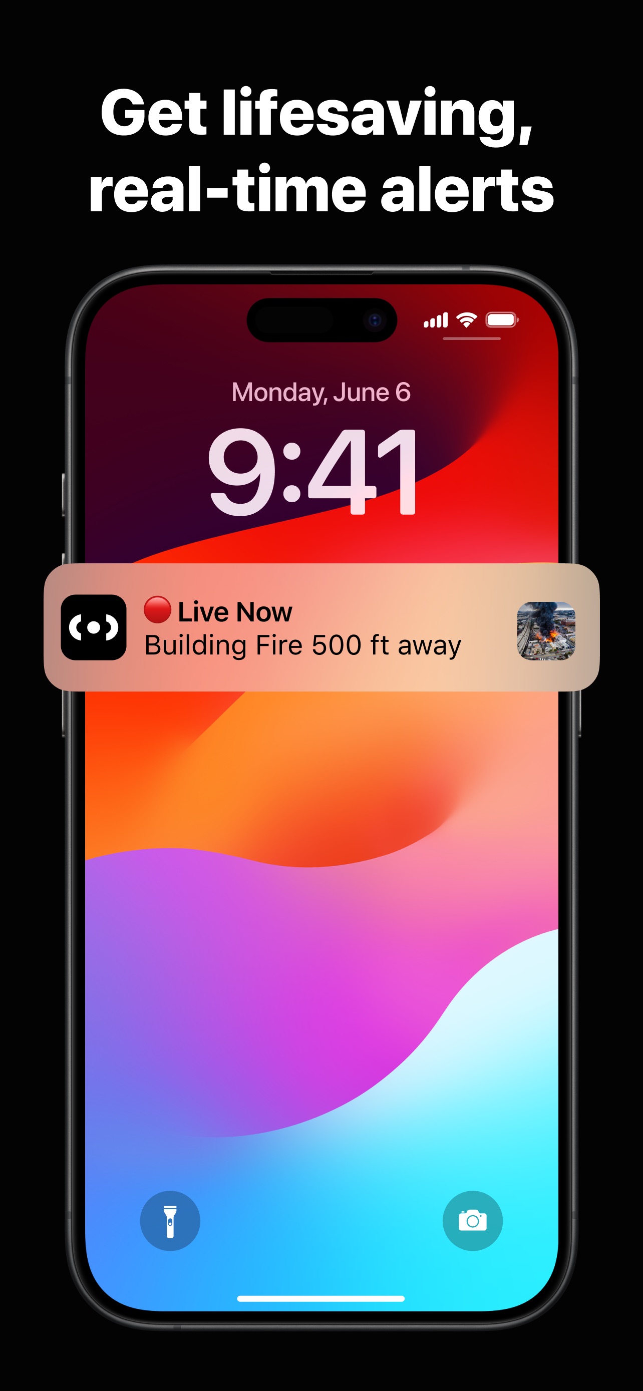
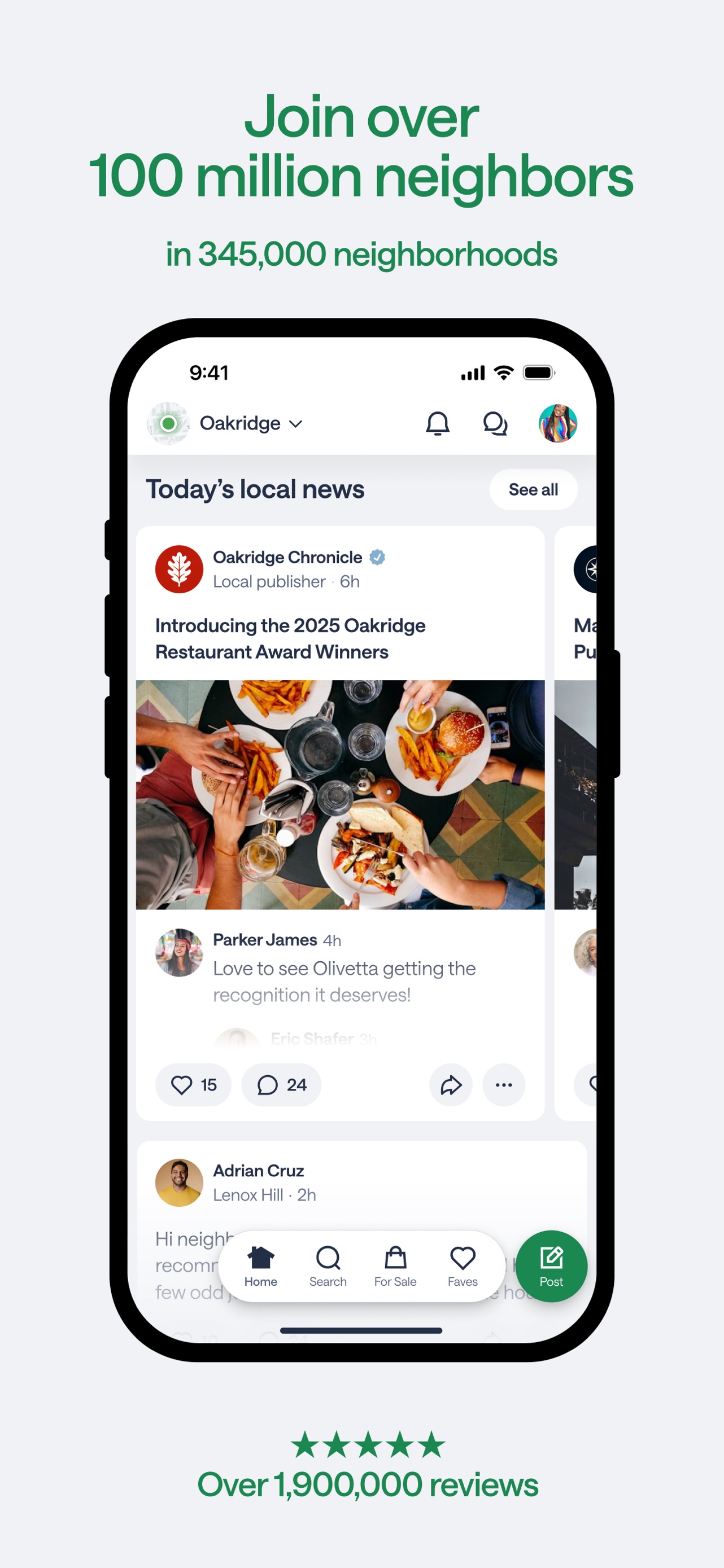
The sequence starts with a utility hook (finding opinions), moves into real-time relevance (being first to know), highlights emotional community support, and concludes with the scale of the platform's user base.
iPhone gallery
The complete screenshot set
Select any frame to study its layout, content, and palette.
Explore by detail
Study the system behind the set
Reddit’s screenshot strategy leans heavily into its brand identity, using its signature 'Orangered' as a high-contrast backdrop that demands attention in a crowded App Store. The design employs a 'floating UI' approach where the app interface is nested within a white rounded container, creating a clean separation from the bold background and allowing for pop-out elements like the notification card in slide two. The copy is punchy and uses a thick sans-serif font that mirrors the brand's editorial style. A key takeaway for designers is the curated content selection: using highly relatable, high-engagement thread titles (e.g., fatherhood, AMAs) to immediately demonstrate the human value of the platform rather than just showing technical features.
Keep exploring