All apps
View on App Store
4.7
7.3M ratingsScreenshot story
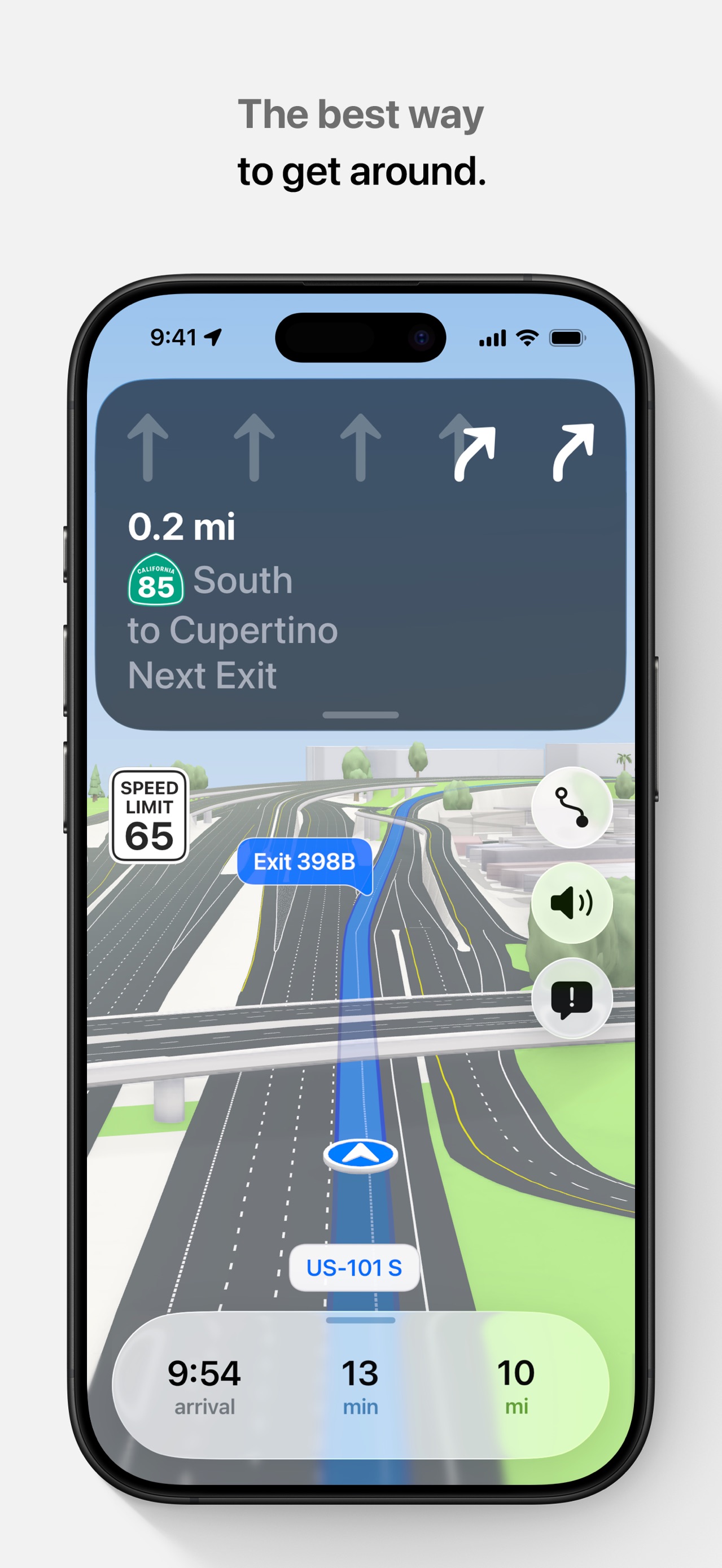
The journey starts with the core reliability of turn-by-turn navigation, expands into advanced AI search and real-time utility, then showcases the app as a social and discovery tool before ending on specialized tech like AR Lens and vehicle integration.
iPhone gallery
The complete screenshot set
Select any frame to study its layout, content, and palette.
Explore by detail
Study the system behind the set
Design analysis
What makes this set work
Google Maps utilizes a 'utility-first' design system, emphasizing clarity and brand consistency. Every slide (except the last) follows a strict template: a centered, floating device on a stark white background with a top-aligned caption in Google Sans. This creates a rhythm of reliability. The copywriting is brief and task-oriented, focusing on 'what you can do.' Designers can learn from their use of intentional UI highlights-bright navigation greens, red traffic lines, and blue AR arrows-which act as visual anchors in otherwise complex map data. By segregating features like business reviews, custom lists, and AR Lens into separate frames, they ensure the user isn't overwhelmed while proving the app's immense breadth. The final lifestyle-photo of CarPlay serves as a critical 'proof of utility' in a real-world context.
Keep exploring
More in Navigation