All apps
View on App Store
4.5
7.9K ratingsScreenshot story
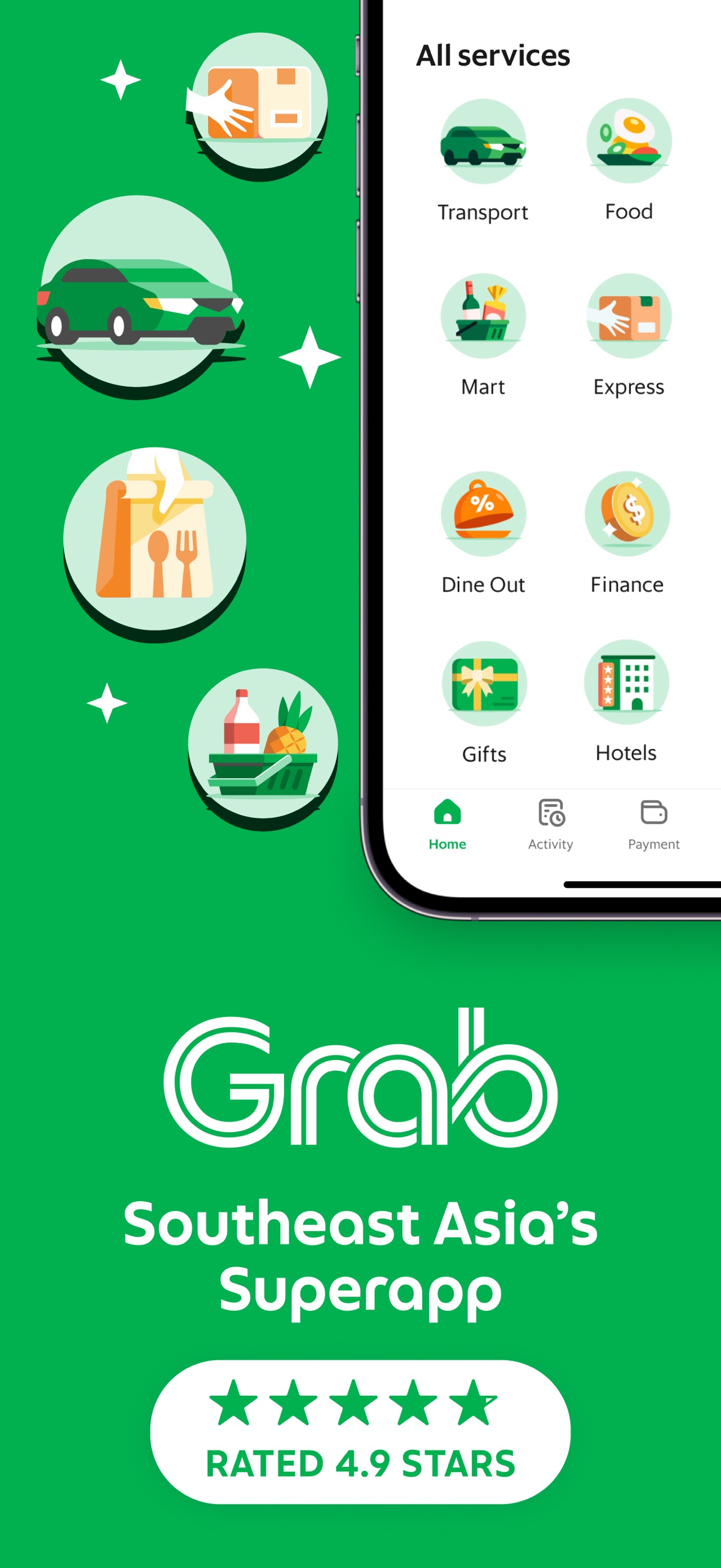
The set opens with a high-impact financial incentive for new users before rotating through its 'super-app' services-transport, food, logistics, and grocery-repeatedly reinforcing the dual pillars of speed and affordability.
iPhone gallery
The complete screenshot set
Select any frame to study its layout, content, and palette.
Explore by detail
Study the system behind the set
Design analysis
What makes this set work
Gojek employs a color-coded service system to manage its super-app complexity: mobility and logistics use brand green, while food and groceries shift to a warm coral red. This helps users mentally categorize the features as they swipe. The layout uses floating devices with exaggerated UI callouts-large green or pink tooltips-that highlight the most critical data points: price and arrival time. Copywriting is repetitive and rhythmic, ending almost every slide with 'AFFORDABLE FARE/PRICE' to lower the psychological barrier to entry. Designers can steal the use of patterned backgrounds (subtle dots/grids) to add depth to flat designs and the way secondary floating icons above the devices clarify the service type (car, bike, box) instantly.
Keep exploring