All apps
View on App Store
4.9
2.9M ratingsScreenshot story
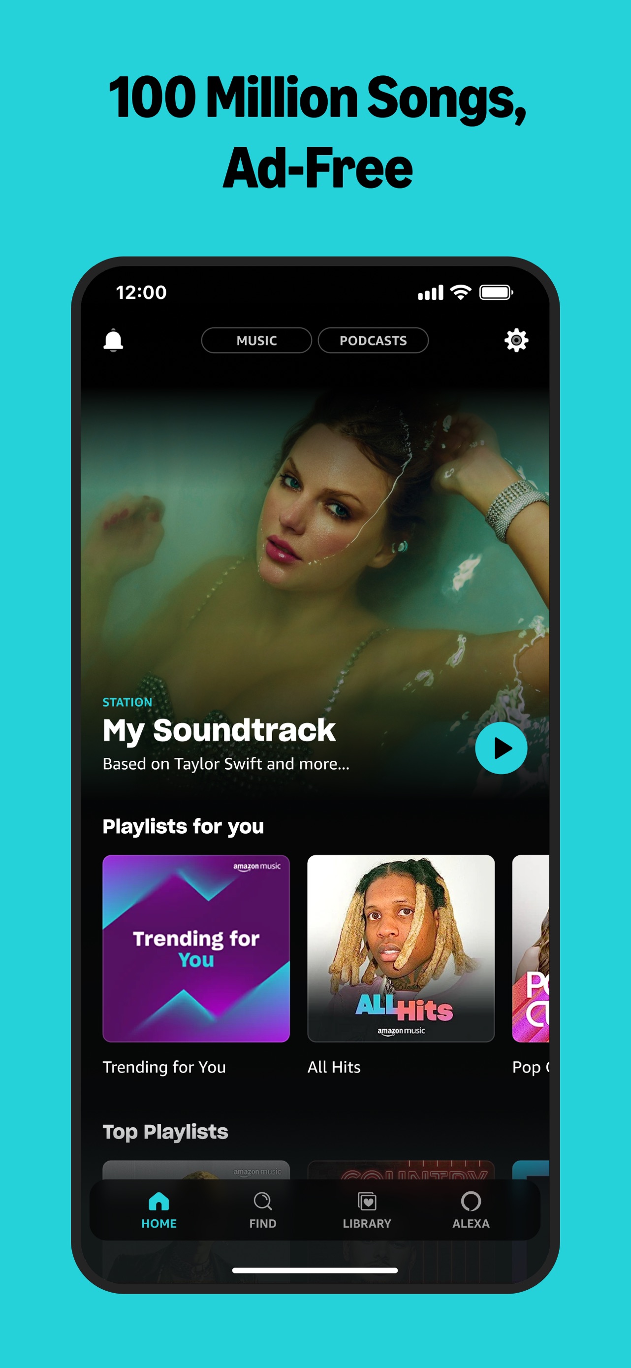
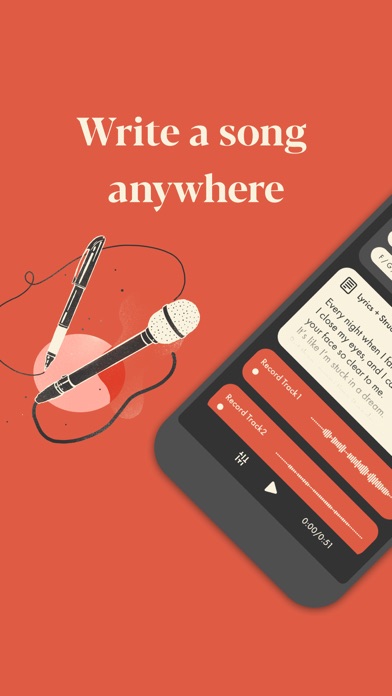
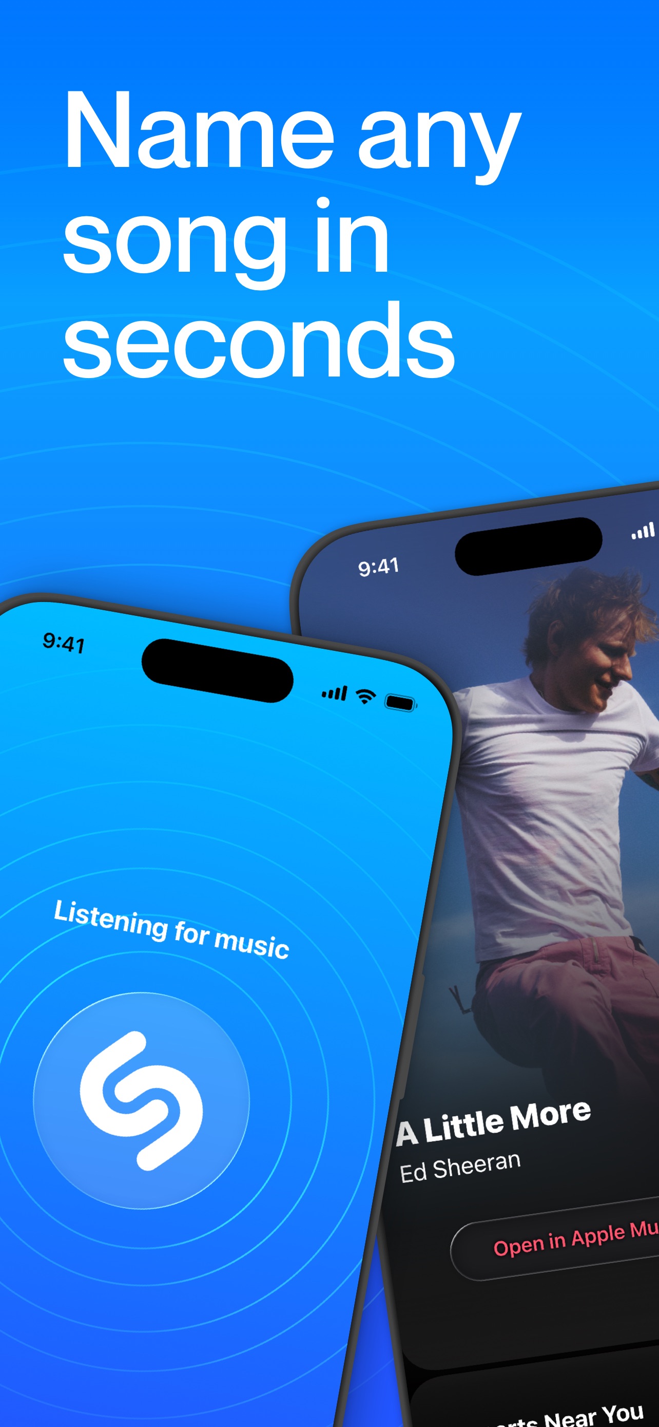
Apple Music hooks users with its massive ad-free catalog before showcasing unique tools for creation, immersive playback features, and technical superiority. It concludes by highlighting the added value of exclusive radio content and industry access that elevates it beyond a mere streaming utility.
iPhone gallery
The complete screenshot set
Select any frame to study its layout, content, and palette.
Explore by detail
Study the system behind the set
Design analysis
What makes this set work
Apple Music utilizes a highly structured, Apple-standard screenshot system. By placing the UI within a centered floating device against a neutral off-white background, the focus remains entirely on the vibrant, high-contrast album art and interface. The copywriting is distinctively Apple: bold red titles that lead with a punchy benefit, followed by a clarifying subtitle. Each screen highlights a specific differentiator-from 'Playlist Playground' to 'Spatial Audio'-proving the app is more than just a library. Designers can learn from the 'dynamic-mode' showcase, which alternates between light and dark UI based on content types to maximize visual impact. The strategy balances technical excellence with emotional, content-driven appeal.
Keep exploring